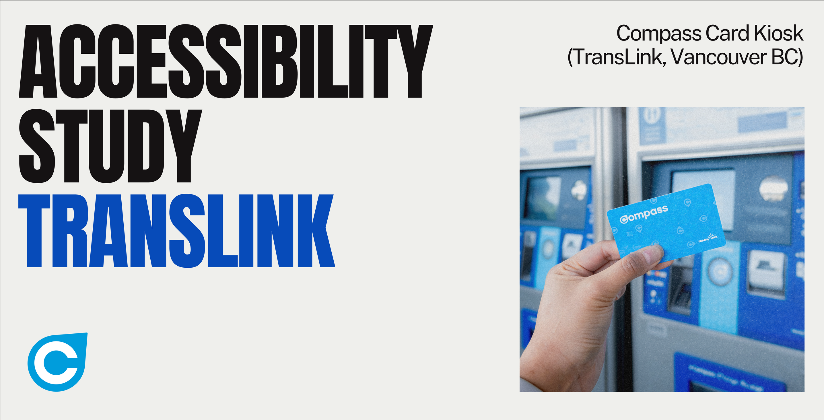
Compass Card Redesign
Redesigning the Compass Card tap-to-enter and fare experience to be fast, intuitive, and accessible, with clear visual/audio/tactile feedback across real commuting contexts.
Project Details
Role
Lead UI/UX Designer
Timeline
12 weeks
Team
2Junior Designers
Skills
Overview
The challenge was to create a digital experience that would resonate with users while maintaining brand consistency and pushing the boundaries of what's possible in the digital space.
Through extensive user research and iterative design processes, we developed a solution that not only met business objectives but exceeded user expectations. The focus was on creating intuitive interactions that guide users naturally through the experience.
The final product demonstrates how thoughtful design can transform complex problems into elegant solutions, creating meaningful connections between users and the brand.
40%
Increase in user engagement
2.5x
Improvement in conversion
98%
User satisfaction score
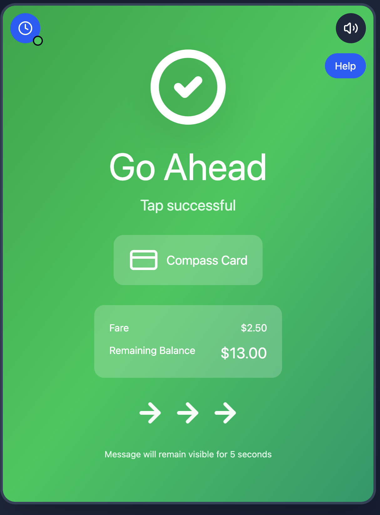
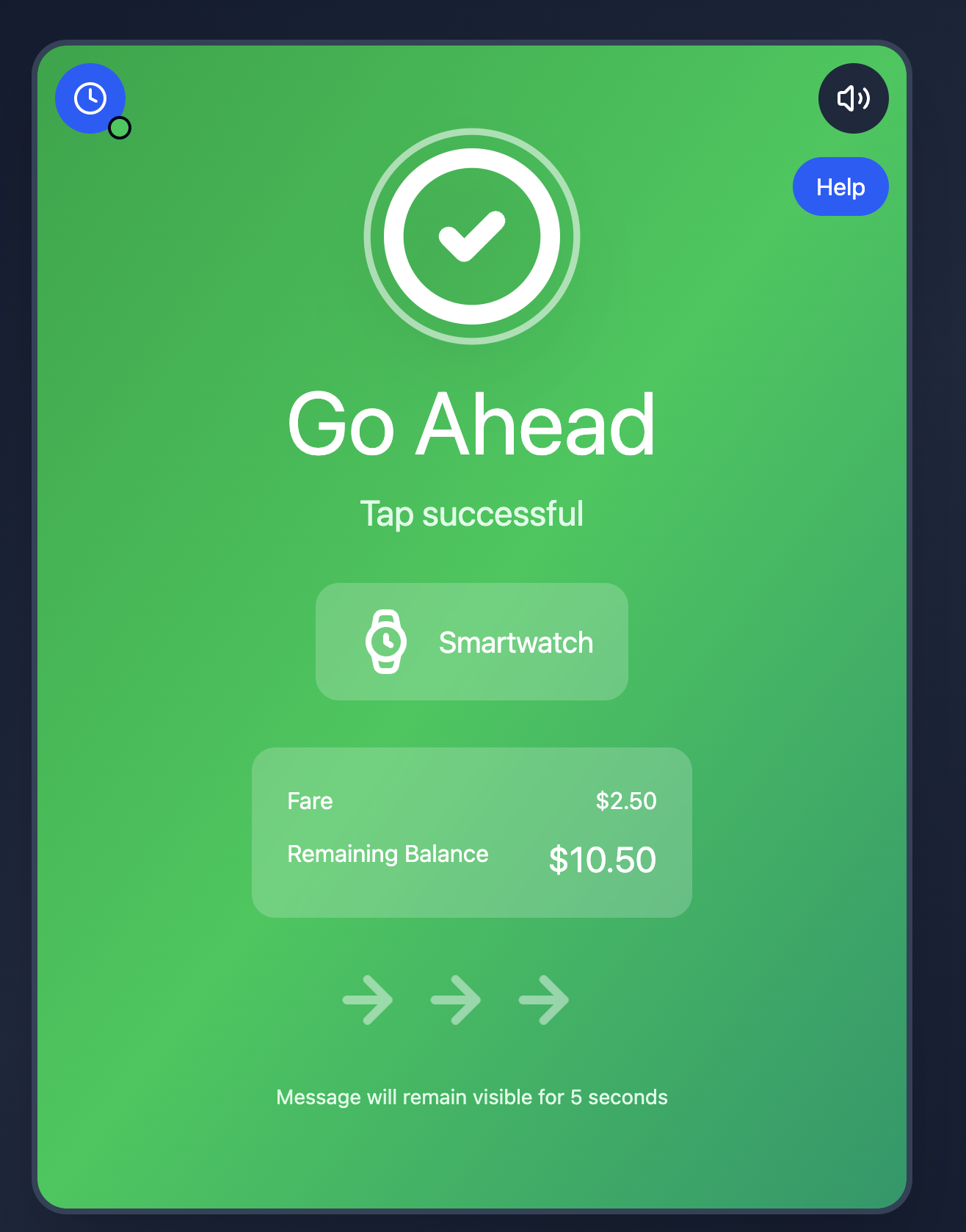
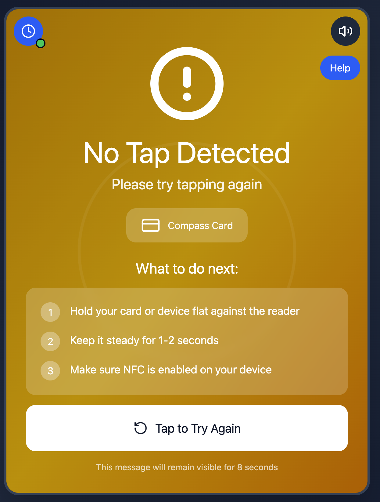
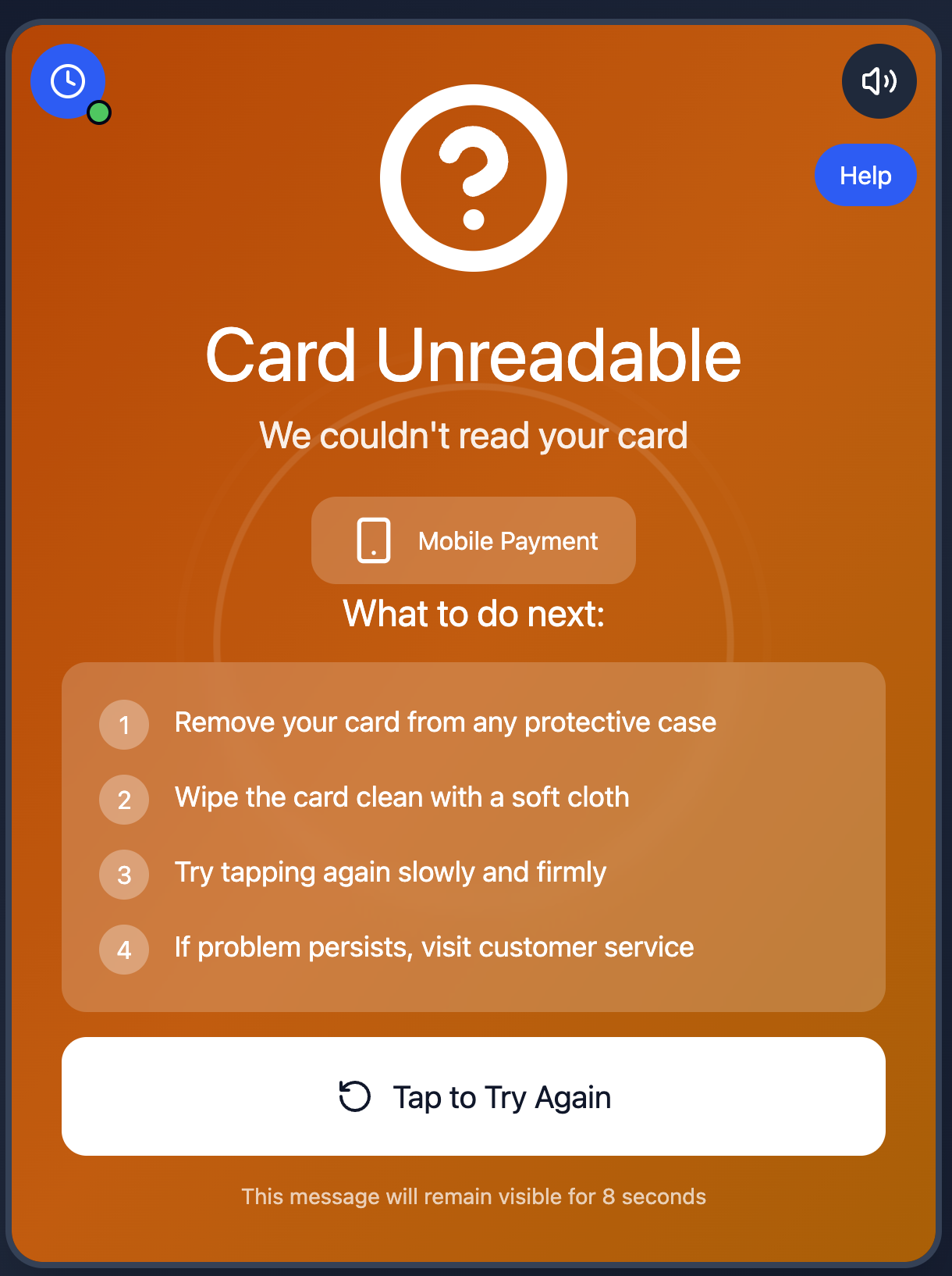
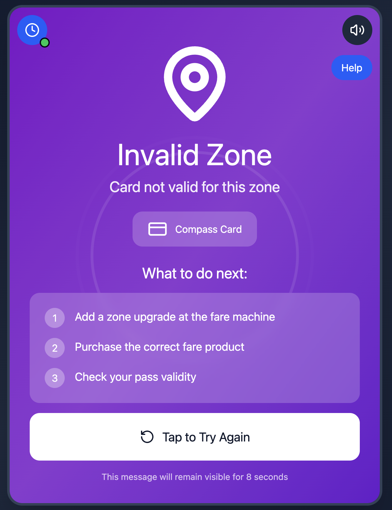
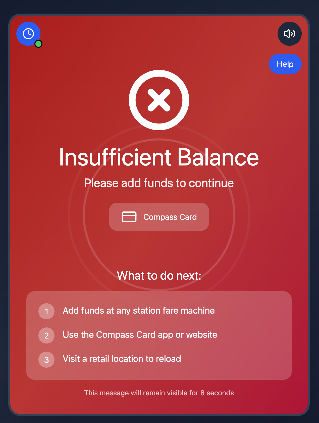
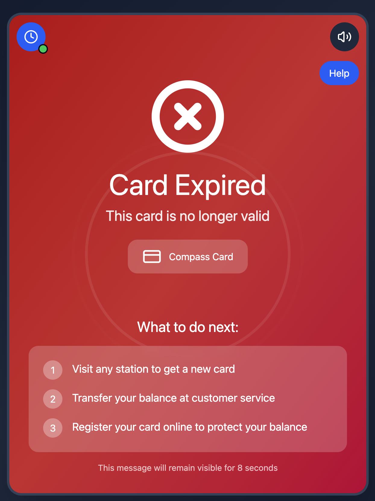
Gallery
Key screens and interactions from the project